So, what’ s wrong with this chart?
Someone, who would prefer to be anonymous, recently reached out to #AskMeraki to weigh in on a visualization released by Sierra Leone’s Ministry of Information and Civic Education. This chart was apparently released by the ministry to make the case that notwithstanding the comparably higher regional air fares, passenger traffic through Sierra Leone’s recently refurbished Freetown International Airport (FNA) had increased between 2022 and 2023.
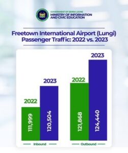
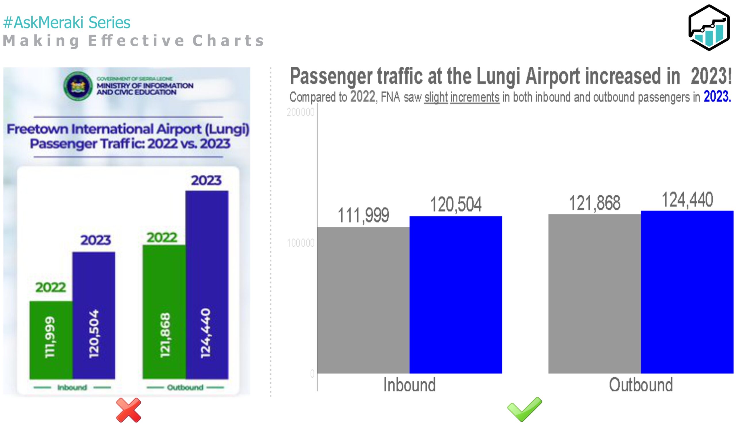
The chart in question is shown in figure 1. The person was convinced that there was something unusual about the chart but could not really say what. They needed a technical explanation which is what this first edition of the #AskMeraki would hopefully provide. As a budding data science firm in Sierra Leone eager to promote data literacy, we did not think twice about jumping at this opportunity to talk about presenting data effectively and ethically. To be clear, we will focus solely on the chart, not the passenger figures themselves, which we believe could also benefit from a more insightful analysis.
At a glance, the chart looks aesthetically appealing. The choice of a bar chart was appropriate, and the colors and labels used are quite okay. BUT…
A more careful examination reveals something perplexing: This plot seems to show a huge difference in passenger numbers between 2022 and 2023 for both inbound and outbound air traffic but looking at the numbers: the difference is not actually very large! Comparing the bars for the inbound passengers in 2022 with the bar representing outbound passengers in 2023, it appears as though the number of outbound passengers in 2023 was more than twice the number of inbound ones in 2022. In reality, the difference is only slightly above 12,400. The problem is that the bars in this chart do not start from the origin. They probably start at somewhere around the 100, 000 mark, which is rather misleading.
The lengths of the bars in a bar chart should always correspond to the magnitude of the quantity being displayed. Plotting a bar chart with a non – zero baseline is, therefore, almost certainly never a good idea.
How do we correct this?
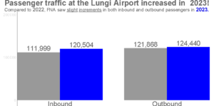
It’ s straightforward! We simply ensure that the bars start at the origin. As shown in the modified plot, the difference in the number of passengers in the two years are now visually smaller. This is a more accurate reflection of the change compared to the original plot. This example perfectly illustrates the ethical issues around data analysis and visualization. Beyond tampering with the data or hiding relevant information, the way data is presented can be accidentally or purposefully misleading. This is a very serious ethical violation. As Alessandro, Moura (Ph.D.), who teaches the Data Visualization course at the University of Aberdeen, would say, “Presenting data in a misleading way breaks the implicit trust that must exist between data producers and their audience “.
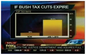
But the Ministry is not alone. In 2012, FOX NEWS, the popular American TV network, shared a terribly misleading picture of what could happened if Bush’ s tax cuts were suspended. The plot, which is shown below, painted a very gloomy picture of the proposed tax outlook even though the actual difference was only 4.6%.
Back to our remake of the Ministry’ s plot. You may notice that we made a few other design changes to the original plot to de-clutter it and tell our story more compellingly, while maintaining accuracy. For instance, we used colours more sparingly and intentionally. In addition, the title and subtitle contribute to the story we are trying to tell. They don’t just name our plot; they tell a story. Part of the even serves as an improvised chart legend, enabling our audience to infer which bar represents 2022 and which one represents 2023. This eliminated the need to insert a legend directly on the chart, thus producing a much cleaner output.
Download full PDF here.

